DESIGNTIDE TOKYO 2011
Prismic Gallery 2012
"Sharp-pointed thorns.
It is a manifestation of its aggressiveness that it will not let others come near,
And a manifestation of its own weakness.
Aggressiveness and Weakness
When wrapped around in the two conflicting senses,
I feel like reaching out and touch the pain in spite of myself."
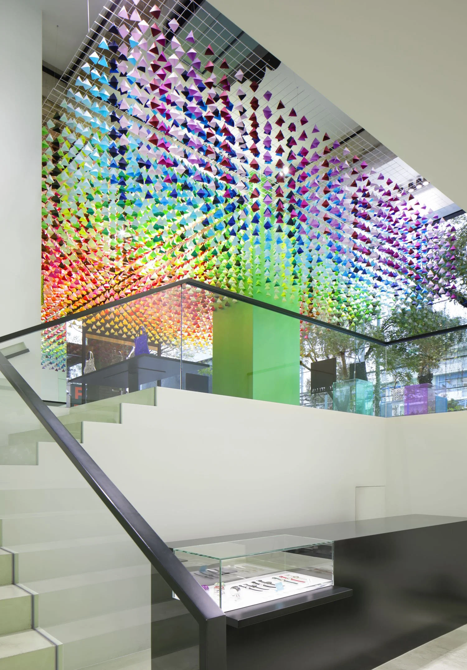
Toge (Japanese for thorn) is a modular product. Each "thorn" gives the viewer the impression of a sharp and stiff object, but these modules can in fact be freely combined to create a soft, pliable and standalone space. At DESIGNTIDE TOKYO 2011, Emmanuelle arranged five hundred of these Toge modules in 15 different colors to form a wedding dress. This conceptual piece was an exercise in contradictory impressions and sensations - solid and stiff but soft and pliable, menacing yet gentle.
DESIGNTIDE TOKYO 2009
Prismic Gallery 2012
56 slender colored acrylic sticks, embedded randomly into a piece of transparent acrylic, create a beautiful landscape, reminiscent of a colorful shibafu or lawn. The sticks support a transparent acrylic panel, while refracting and reflecting light as if they were soaking under water. They appear and disappear, and even seem to bend at times. These beautiful illusions and colors create a low table with infinite expressions.
ANY TOKYO 2013
Coca-Cola has updated its classic icon - the Heritage Glass - the modern interpretation of a Coca-Cola glass, designed by innovative designer Thomas Meyerhoffer. After the new release at Colette, the famous boutique in Paris, Coca-Cola has released its new icon in Tokyo, together with an art installation by Emmanuelle Moureaux.
The installation "sparkling bubbles" uses 800 acrylic transparent spheres bringing the experience of the bubbles and sparkles of freshly poured Coca-cola. Small air bubbles are locked inside in each sphere, which appears as if the bubbles are floating in the air.
These spheres are dyed in delicate shades of 34 different colors chosen specially for this installation.
The reflection of lights and the layers of colors create a spellbinding moment, capturing the magic of the drink. The installation changes its expression seeing from different angles, which is the interpretation of the personal emotions from drinking Coca-Cola.
2010
ISSEY MIYAKE (women, men)
PLEATS PLEASE ISSEY MIYAKE
Aoyama, Tokyo
concept : unbalanced balance
411 sticks connecting the two spaces
Their colors and shadows float and overlap,
creating a new space
with a new appearance.
Like flown away into space and floating there,
the sticks spread all around the space.
As if time stands still,
"a balance out of balance" is created.
The concept of sticks was inspired by a European children's game "MIKADO", which was often played before. The sticks randomly positioned as inspired by MIKADO create tensions and chance balances, which were designed to become tangible forms. It was designed to be structurally balanced in spite of its unbalanced appearance.
100% design TOKYO 2007
100% design LONDON 2008
DESIGNTIDE TOKYO 2008
Prismic Gallery 2012
concept : unbalanced balance
Exhibited during the 100% Design Tokyo 2007 show to finally realize a long-thought of idea, the inspiration for "stick chair" came from "Mikado", a pick-up sticks game which originated in Europe. A total of 7 round wooden sticks (φ18) placed obliquely support the heavy piece of acrylic creating the perfect balance. The structural balance has been pushed to the limits and although it looks unbalanced, this architecture like structure was developed after many attempts to achieve an "unbalanced balance". Due to its beautiful refraction effects the sticks appear as if they are soaked underwater.
2020
Taipei (Taiwan)
concept : shine
In 2020, the Mass Rapid Transit "Circular Line" will open in New Taipei City. Drawing a large circle, Circular Line will connect the existing lines that spread in radial direction from the City Central. Circular Line is a groundbreaking scheme that will dramatically improve the transport system, where the Taipei City Department of Rapid Transit Systems (DORTS) is responsible for the project and its construction. They plan to have the transportation facility, the Circular Line, as a work of public art piece, for the very first time in the world. In 2011, Emmanuelle has been invited directly from DORTS, as an artist recognized for her use of colors, to engage in the design of this grand scale public art project.
Circular Line is a subway system, total length of 34.8 kilometers, in which its 14.5 kilometers are above ground facilities. The project focuses on this 14.5 kilometers zone, where there is a close relationship with the people in the city. Emmanuelle’s color palette will spread across a wide area, which comprises 8 kilometers of steel beams, 10 kilometers of acoustic barriers, around 200 steel pillars underneath the station and viaducts, 13 stations, 13 platforms, a bridge, and the exterior and interior design of the four cars MRT train. Until the opening in 2019, color workshops will be held by Emmanuelle mainly for residents and teachers in New Taipei City, together with other art events.
The concept "shine" was inspired from the theme for the Circular Line project stated by DORTS, 'Like clouds swift passage, the dragon travels thousands miles', and the color scheme of the line, which is "yellow". The "yellow" gave an image of bright sunshine that was the inspiration to the word "shine", expressing the sunshine being reflected off the scales of dragon. "Shine" wishes that the brightness will spread along the whole Circular Line as the swiftly moving dragon reflects sunshine off its scales, through the bustling City of Taipei.
Building upon this concept, the characteristic of the project is the 5 shades of yellow selected by Emmanuelle, being the base color scheme for the city’s public art. As a surprise gift from her, there is just one location unveiling all colors from her rainbow color palette.
The project is still ongoing, and Emmanuelle wishes that this grand scheme of public art project will give brightness and harmony to the lifestyle of Taipei citizen.
photo : DORTS (Department of Rapid Transit System)
March 19-25, 2019
Imabari City Auditorium
Japan
Imabari City in Ehime Prefecture is known for its quality towels and for its leading textile dyeing industry. For the “IMABARI Color Show” introducing the dyeing technology in Imabari City, Emmanuelle revealed an installation "1000 COLORS WAVE", using her own 1000 (one thousand) colors palette specially created for the exhibition. It is the second installation realized for the “IMABARI Color Show” after the 2017-2018 exhibitions in Spiral Garden and Imabari City.
Even though the same water, formula, and environment are utilized during the dyeing process, the slightest change in weather and/or temperature can completely disrupt the result of the pigmentation. However, in the skilled hands of the craftsmen of Imabari, the dye process is so precise, 1000 unique colors of fabrics are possible.
One thousand pieces of textile specially dyed in 1000 different colors covered the 1002 seats of the Imabari City Auditorium, designed by the famous architect Kenzo Tange. The bright colors palette gave off an energy that created an astounding wave of colors which engaged with the ceiling of the public hall.
"1000 COLORS WAVE" was created by the fusion of Emmanuelle's colors with high quality skills of Imabari's dyeing technicians. The technique of "dyeing" and the creation of "1000 colors", multiplied by the delicacy of both have became a grand installation.
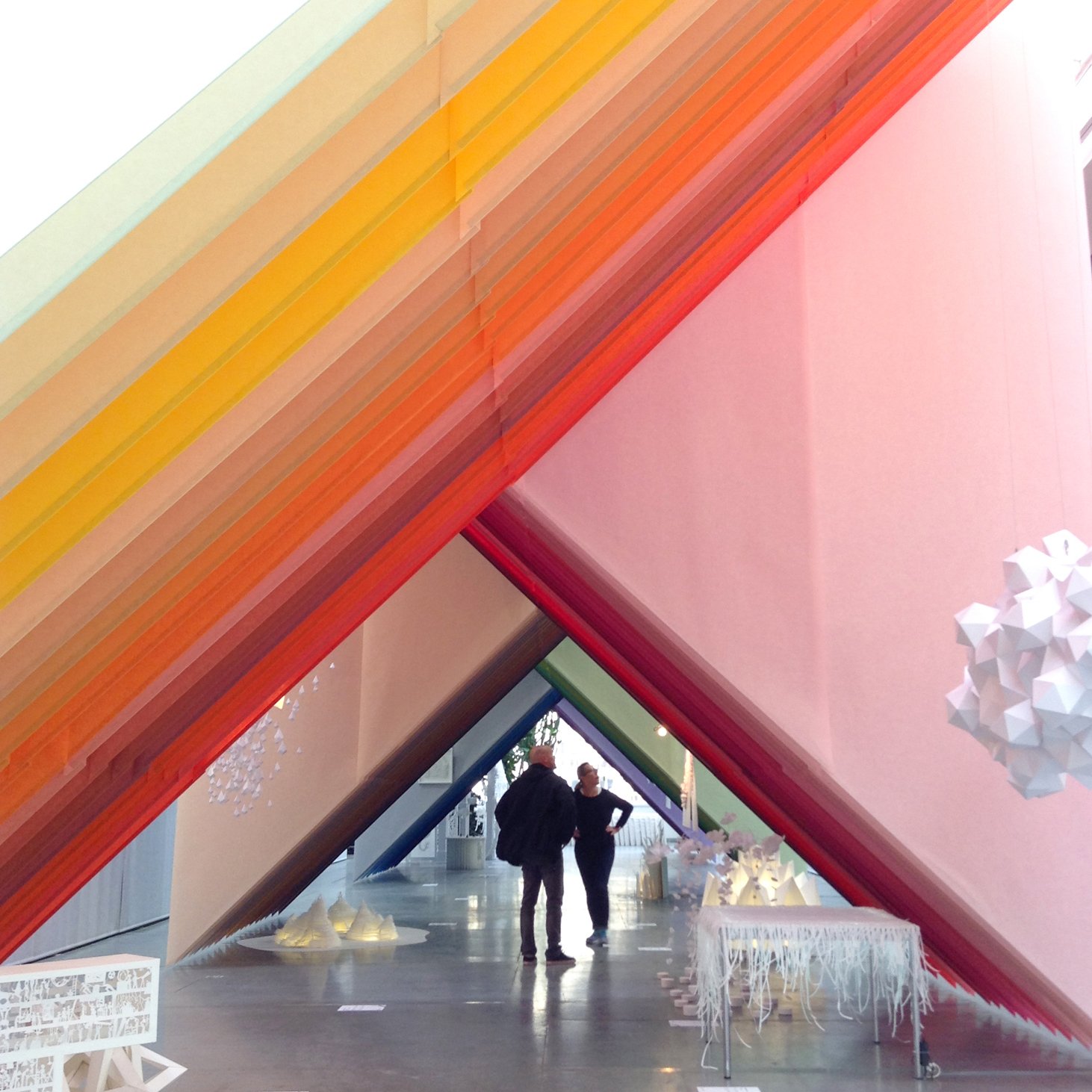
DESIGNTIDE TOKYO 2010
Prismic Gallery 2012
Beauty shown by plants in the natural world. Spreads of trees, colors of flowers, flows of leaf veins, linkages of cells. Everything is in a systematic harmony.
In eda, forms are determined according to the natural system. eda is assemblages of fine lines. Each line exists straight, and large complexities contain small simplicities.
Biological forms overlap rhythmically, link air with another and create new space orders.
Eda, meaning "branch" in Japanese, is a modular product that combines (interlocking to each other / you link to each other) to create spaces. For its 1st presentation at DESIGNTIDE TOKYO 2010, emmanuelle designed an installation consisted of 2000 eda, suspending 900 colored one and creating a free-standing structure on the floor with 1100 white one.
December 6-8, 2016
Procédés Chénel
Headquarters & Showroom
Vanves (France)
Installation / Scenography (Carte blanche)
This work is an installation created to mark the 120th anniversary of Procédés Chénel, a French paper manufacturer.
Invited under a carte blanche commission, Emmanuelle conceived the entire space around the concept of layering—kasane.
Reflecting the 120-year history of the company, 120 monumental triangular sheets of Procédés Chénel paper are layered throughout the headquarters and showroom, a vast space extending approximately 43 meters in depth.
The installation employs a palette of 75 colors, overlapped to create shifting relationships between color and depth, generating a rhythmic sequence of layers that unfolds as visitors move through the space.
The installation also incorporates objects by various paper artists, with Moureaux designing the overall layout and spatial flow that connects these individual works.
Within the expansive architecture, the lightweight material of paper envelops the body and the gaze, unfolding as an installation that reveals how layers generate new spatial experiences and relationships.
Dec. 1, 2019 - Jan. 3, 2020
REALITY LAB. ISSEY MIYAKE
Tokyo (Japan)
Holiday Window installation for BAO BAO ISSEY MIYAKE new collection PLATINUM.
April 2018
5 countries 8 cities 11 stores
For the release of BAO BAO ISSEY MIYAKE's new tote bag "MISTY MOON", Emmanuelle has created window installation "rainbow moiré".
In order to respond to the unique sense of translucency of the new collection, small triangular pieces are finely cut out from a layer of paper to create delicate mesh of colorful lines. By increasing the number of layers and applying shades of colors, the subtle changes of colors gives three-dimensionality in design.
Depending on the viewing angle, the overlapping lines change its expression, and a beautiful rainbow-colored moiré is born.
The installation has spread in 11 stores in Japan and worldwide, including REALITY LAB. ISSEY MIYAKE in Aoyama (Tokyo) and ISSEY MIYAKE GINZA / OMOTE in Ginza (Tokyo). The graphical design and acrylic floor standing design were also developed beside the window installation.
IMABARI COLOR SHOW
December 7-10, 2017
SPIRAL, Tokyo
February 2-12, 2018
Port Community Center, Imabari
Imabari City in Ehime Prefecture is famous for its high quality towel production. The land is blessed with good quality water, which has lead to an accumulation of excellent dyeing techniques. For the "IMABARI Color Show" introducing the dyeing technology in Imabari City, Emmanuelle revealed an installation "1000 COLORS RECIPE", using her own 1000 (one thousand) colors palette specially created for this installation, the most number of colors she has ever used in her works. The installation visually conveys Imabari's dyeing technology and a new world of colors that no one has ever seen.
The concept of this installation is "1000 COLORS RECIPE". It is a visualization of the delicate and accurate "recipes" required for dyeing. The elements that make up the recipe are the percentage of three principles of COLOR "C (blue) / M (red) / Y (yellow)",
TEMPERATURE "°C", TIME "minute / second", and VALUES composed of numerical figures "0" to "9".
By precisely managing all of these elements, colors delicately different to each others are created.
These 17 types of symbols that make up the recipe were dyed in 1000 different colors, and they were cut out in the shape of symbols, connected with thread, and then suspended at the center of the atrium of the Spiral Garden (SPIRAL, Tokyo).
1000 colors are condensed to form a circle at the center, one color for one thread, and the un-dyed white symbols wrap the outer circumference emphasize the existence of 1000 colors. The total number of symbols used is about 17000. Symbols are arranged in three dimensional grid, while they may be seen floating aligned or chaotic depending on the viewing position. When sitting under the symbol, you will see various recipes as you drown in colors.
"1000 COLORS RECIPE" was created by the fusion of Emmanuelle's colors with high quality skills of Imabari's dyeing technicians. The technique of "dyeing" and the creation of "1000 colors", multiplied by the delicacy of both have became a grand installation.
2014 August - October
Global art installation in Tokyo, New York, San Francisco, Shanghai, Berlin, London and Paris
concept : thin thin thin
2014 fall - emmanuelle has created an installation for the launch of UNIQLO's autumn item, "extra fine merino". Beginning from Ginza flagship store then to other global flagship stores, such as Fifth Avenue NY, 311 Oxford Street London, and Paris Opera, it is a simultaneous global art installation in 6 countries to celebrate the beginning of autumn season.
Thin and long colorful threads, representing strands of merino yarn are made into three dimensional volumes that intersect inside the windows with mannequins positioned in between. The installation has started at Ginza flagship store, on the facade and the glass case. Inside the store, the main glass case uses 2,420 threads in 60 shades of colors to create volumes, radiating from the floor to the ceiling. The long thin lines cross and intersect three dimensionally, and the expressions of layered threads change as the view keep shifting. On the facade is a graphic interpretation of the thin merino yarn layered with white graphic lines on the front glass, intended to give depth to the window.
AMBIENTE 2014
Frankfurt (Germany)
As part of the "manufacture x designer" project organized by the general incorporated association Japan Creative, "awa", which means "foam" in Japanese, was unveiled at Ambiente 2014, held in Frankfurt, Germany. The "awa" was created through collaboration with SANYO, which processes and sells synthetic resins products, including soft PVC.
Emmanuelle saw the faint transparency and the soft gesture of PVC as "foam" that gently wraps air and slowly changes shape with calm movement, which she developed into a motif for the new design.
To express the delicate appearance of the foam, Emmanuelle focused on the beauty of the cross sectional view of 0.15mm thick soft PVC, rather than the surface that is normally shown in general use. The PVC is cut into 10mm wide tape, forming a module with a series of pentagonal foam patterns. The total of 182 modules in 14 shades of colors are assembled and woven together, which float in the space. The foam modules float in the air like the soap bubbles shinning in rainbow colors, creating beautiful scenery as the foam gently moves and colors overlap. The unprecedented expression of faint and subtle spatial element has brought out the fundamental appeal and new possibility of soft PVC.
2013
Shibuya Hikarie
Tokyo
2013
Ginza POLA THE BEAUTY
Tokyo
This project "puzzle building" takes inspiration from skyscrapers. The pleasant rhythm composed of the colors and space will lighten the passerby's hearts.
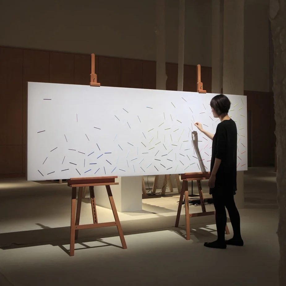
DESIGNTIDE TOKYO 2012
"toki" (which means "time" in Japanese) project investigates the universal element of time, expressed through the work composed of an array of sticks presented in various hues.
Each stick moves in circular motion through the implementation of magnets, which is an abstract representation of time.
2012
Shinjuku Isetan & Nihombashi Mitsukoshi Department stores
Tokyo
Issey Miyake commissioned Emmanuelle to handle the set design and art direction for their event, Bloom Bloom Bloom.
Inspired by spring flowers in bloom and Issey Miyake's newest incarnation, this event was held in conjunction with the launch of Bloom Skin, Yoshiyuki Miyamae's first collection since joining the branch as their new designer. The event took place at both Isetan's Shinjuku branch and Mitsukoshi's flagship store in Nihonbashi.
These "stick flowers", with their straight lines and contours, were conceived as a contrast to the translucent designs of the soft, flowing pieces in this collection. Each measuring 1.4m across, these vibrant and colorful flowers were deployed as both three-dimensional sculptural pieces and two-dimensional graphic motifs, giving the overall impression of a stage "in bloom".
Stick Flower represents an extension of sticks, a series of display windows produced for Issey Miyake's three Aoyama outlets in 2010, as well as toge, an installation that was exhibited at DesignTide Tokyo in 2011.
For Bloom Bloom Bloom, Issey Miyake also commissioned us to design logos and outdoor signs for the department store. The Stick Flower motifs were also used in a series of limited edition T-shirts and package designs for accessories and products.
2009
CS Design Center
Tokyo
CS Design Center displays as many as 1100 colors. This exhibition focuses on one color - yellow, red, green, blue or black - at a time. Every month, the space is designed with a different color, changing hues like a kaleidoscope: a rediscovery of colors that ordinarily pass unnoticed in everyday life. The exhibition space changed every month over a period of five months.